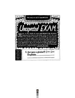
LAB: The much-beloved one-panel serial, Hall of Best Knowledge, closed up shop last month. What were some of your reasons for retiring HOBK?
RF: Well, when I originally started it I told myself I would do it for a year, no longer. I think I passed that by about 3 months, and so it was time to sort of initiate the shutdown sequence. I was still really enjoying it but wanted to end it while I was still proud of the work. If you care deeply about something you work on, and you know that at least two other people feel the same way, you kind of owe it to yourself and those people not to have it go downhill. It’s painful for me to watch something like The Simpsons now because it’s just a tattered corpse version of its former self. It’s like having your funniest friend die, and then lo & behold someone keeps digging them up and bringing them to parties. The decay, the stench, it’s not good for your fond memories.
Any plans for a book?
Yes, absolutely, I’m working on that. As much as I loved that people could see HOBK online, I’ve always made it with the hopes that it could be viewed in book form. You pick up on a lot more when you can just sort of settle in with a book in your lap, because it’s obviously a much more intimate context. Plus, if I was to read it with my laptop on my lap, I would probably seriously burn my crotch, maybe even lose the ability to have children. I don’t want people to have horribly-scalded genitals. The designer and book lover in me also has a pretty strong desire to see it in print. I mean, some nice warm-white paper and a massive, 20-colour silkscreen fold-out poster of myself writing poetry in a little rowboat or something… it would be glorious.
Especially the fold-out poster. Although I was actually hoping it would be of you writing poetry while riding a pony. Do you think that would feasible?
That would be splendid, although my mom would maybe take offense, because she trains people to ride horses and having her son riding a pony would probably be insulting. She could never get me to ride horses, so it would be a huge slap in the face. I guess what I’m saying is that maybe you should RIDE YOUR OWN GOD DAMN PONY.
Touche, sir! Moving on: according to your site, your day job involves managing a soon-to-be letterpress print shop. Could you tell us a little more about that?
I’m working at NSCAD (the art school I graduated from here in Halifax), helping to set up a letterpress print shop as a sort of commercial enterprise part of the school. It should be up and running in the new year, selling letterpress-printed ephemera of all sorts and doing custom jobs. I’ll be the head designer and printer, but there will be some completely unfortunate people working with me as apprentices. God forbid I would do something that doesn’t involve lettering or typography. Talk about a one-trick pony.
Again with the pony motif! What type of work will the letterpress be handling? In truth, that sounds like a dream job— head printer! With apprentices, to boot! Will you make the apprentices wear aprons and maybe floppy hats?
Actually they will have to wear aprons, but they are really nice ones! We’ll be printing a little of everything: cards, stationery, broadsides, wedding invites, posters and limited edition prints. It really is a dream job.
How did you get involved with setting type?
Like many designers and artists I was always pretty intrigued by the whole process, and the last year of my studies I was lucky enough to take some classes with an amazing printer and bookbinder, Joe Landry. For our first project we were supposed to do something like a business card, but I thought it would be fun to try to typeset these old dense typographic almanac pages. It was ridiculously frustrating-setting type the size of toothpicks for your first outing can be a wee bit nerve-wracking— but also incredibly satisfying. Letterpress is amazing because you get to do both conceptual work and manual labour, and that balance of the different tasks is nice. The printed result is pretty hard to beat, too. On a simple level, even holding a piece of type in your hand can be a wonderful thing, in that it is a physical and direct connection to an incredible amount of history.
I’ve seen your online gallery of Winnipeg letters… faded turn-of-the-century wall ads, handmade signage, irregular hand-lettering… when or how did your interest in vernacular typography begin? And has any of the lettering around Winnipeg influenced your style?
I don’t really know when or how my interest began, but I am definitely influenced by vernacular lettering, all that stuff you mentioned. I just love all the honesty and humanity of it, it’s beautiful, but also kind of comforting at the same time. Everything around us has this sort of perfected, confident sheen, and we’re bombarded by that every day. So when you have the chance to see something that shows a little vulnerability it’s kind of a relief, it’s like someone is actually trying to make an emotional connection. I’m romanticizing it a bit here, maybe even being a little maudlin, but for me, that stuff is important. I really like to see vernacular signage where it’s mostly normal, like the artist understands the rules of making these letters or forms but has maybe forgotten a couple. Those gaps make for some interesting qualities. I try to work that way, learning how to draw certain things properly to a point so that I understand the basic mechanics, but then let some of it go and let my own ideas interpolate. I think that’s sort of how some folk typography operates, and I love it. What are some of your peeves when it comes to design?My only real pet peeve is when I struggle really hard with ideas at the beginning of a project, which is pretty much 75% of the time. I have a sizable amount of self-hatred so it can get pretty excruciating, especially for people close to me. I’m lucky to have an amazing group of friends and a patient girlfriend though, and that definitely helps to keep things in perspective. It’s good to get intimately involved with what you’re working on, but just as important to take a macro view every once in a while. Maybe I should start taking Quaaludes before I start a project, that might help relax me a bit. Then my pet peeve will be when I am almost out of Quaaludes, which is easily solved by the purchase of more quaaludes.
Which are readily available at your average Printer’s Corner Shop, of course. If you could be any typeface…?
There is this Jorge Luis Borges story— it’s called the Library of Babel, I think— where there is an infinitely large library that contains every book ever written. The books contain every imaginable combination of letters, meaning that while one book might be Harry Potter, the next could be filled with gibberish. I’d like to be the typeface version of the Library of Babel. That, or that novelty face made out of hot dogs. Snazzy.
Snazzy indeed. What are some of your influences?
Not to brag, but I have some pretty amazing friends and peers, and I’m constantly surprised and invigorated by the stuff they’re doing. They’re all so passionate, and very different, so I’m always being introduced to foreign ways of thinking. In terms of people I’ve never met, though, I owe an inspirational debt to visual artists like Ed Ruscha and David Shrigley; cartoonists like Jeffrey Brown, David Rees, Marc Bell; designers like Ed Fella and the Emigr’e folks; type designers like Jonathan Hoefler, Zuzana Licko; writers like Hans Christian Andersen, Jonathan Lethem, the McSweeney’s crowd.
What term offends you least:
1) Cartoonist
2) Graphic Novelist
3) Comic Artist
4) Illustrator
5) Maker of Comics
6) One Who Draws On A Regular Basis, Whether For Purpose of Sharing or Merely for Self-Gratification
Oh, I like 6), it sounds like the kind of watery, timid answer I tend to give. I have a problem labeling myself as any of those things only because I don’t want to insult anyone. If I say I am a cartoonist, illustrator, graphic designer, letterpress printer and artist, that’s five large sectors of creative society that will take offense. That’s a lot of pissed off people, so I think 6) sounds great.
You also do freelance design- what are some of the best/worst parts about that?
I had one client make fun of my clothes and question my sexuality in the same meeting… that was pleasant. As for the best and worst parts of the design world, I would say the best is being able to do something that touches someone from time to time, the worst being how meaningless design can feel sometimes.
If you could have a discussion with any artist, living or dead…
I get nervous talking to important people, so I would rather avoid that altogether. Besides, just because people do work I admire doesn’t mean they would be fun to hang out with. I’d just spend the whole time trying to prove myself worthy of their company and end up peeing on them or something.
Fair enough. I hate it when you find yourself peeing on your idols. Always awkward. Okay. Right then. Are there any trends in modern type & layout that kindle your wrath? Any fonts you particularly despise, that you would give a good box upon the ears if the chance arose?
Kindle my wrath, ha! I like that, especially since my wrath is like a fire, or so I have been told by those who it hath consumed. Honestly though, I try not to look at too much work from other illustrators or designers because it always depresses me and makes me feel worthless or jealous. I don’t think trends are worth getting worked up about. Your rage can be put to way better uses than freaking out about how everyone is using scripts poorly.
If you could pick one (and only one) of the following, which would you choose:
a) a magic typewriter which could type in perfect cursive
b) a Langston monotype caster
c) a cloning machine
d) a government grant to discover the 27th letter of the alphabet
e) a vaccine that would rid mankind of Comic Sans once and for all
Before I pick, I should say that I have a friend who has a typewriter that does cursive, and it is pretty magnificent. I’ll take one of those, please.
You’ve been quoted as saying, “Creative people are just so FUNKY, what with their creative minds always doing something jazzy like funking up a jazzy idea and giving it their own crazy creative jazz-funk funky twist…” Could you elaborate on the uncanny ability of creative people and their propensity to “jazz things up,” as it were?
Ha, wow, I guess when you spray sarcasm out in to the internet it can really come back as a fine mist on your face. I’ll have to keep that in mind. Ahem. To answer your question though, I think CREATIVE people are just so FUNKY. I mean, say you send that CREATIVE guy in the office a WORD document and you know, just say to him
“Hey JAZZFACE! FUNK this up a bit for me, you know, JAM on it with some FUNKY letters or something!!!!!!!!!!! I’ll need that in FIVE MINUTES, okay FUNKMASTER?! You’d better get JAZZING while the rest of us do REAL work, ok?! Think you can find SOME JAZZY little colours and wordies to FUNK the JAZZ out of this SUMMARY OF RECENT JOB POSTINGS TO THE HR DATABASE?”
Funk-ay! In fact, it jazzes the funk out of this interview. Okay. Do you have any gems of knowledge to offer the funky young modern illustrator?
My serious answer would be that good things come out of work that you’re proud of, but you can’t rely on clients to provide the opportunities to make that work. I did the comic and the patterns and all that stuff for fun, and worked hard on it, and that resulted in being able to do some paid projects that were really rewarding.
In other words, though it may sound frightfully cheezy: follow your heart, do what you do best, and the rest will follow. I hope that wasn’t rude of me to paraphrase you… you’ve been a tremendous sport, Ray Fenwick. Thank you for sharing your time & genius with us. ¤


