

Chromaticity
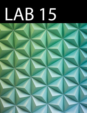
Chromaticity started out as casual lunch-time banter in our office on how colors are terribly misrepresented from screen to print. Having to deal with colours on a daily basis, this unapologetically led to a full-blown discussion of why colors are, well, the way colors are. Akin to Plato’s Allegory of the Cave, we are unknowingly prisoners of our own understanding of colors. Color is three dimensional in nature; a spectral distribution of electromagnetic waves made visible by our evolved visual system. How we perceive colors is better understood in the terms of a viewer’s objective reality. This explains the difficulty when we try relaying our own thoughts on colors to others. We may never truly be able to convey our understanding of the phenomenon of colors through science. Instead, how can we better raise the notion of colors as a malleable entity, one we can manipulated through the physical world? Chromaticity strips the intricacies of color theory and its science down to a leaner approach in engaging visitors with this installation. Colors hues are arranged naturally in an array across the room. Saturation or “color richness” are being tiled with increasing value from bottom up, per column of hue or individual colors of the rainbow. This recreates a recognisble hue palette creatives use in their daily color work.
By introducing a third dimension in this seemingly limited two-dimensional space, folded tetrahedrals form the base element to tessellate the color array. When a light source from the room hits a tessellation, differing facets receive a variation of light, hence creating color’s third dimension, lightness, or commonly known as “value”. At first glance, it may appear that each triangle consists of three distinct colors, but in truth it is nothing more than a simple play of lights and shadows.