Ian Lynam and Cassidy Curtis on typography and street art
•
(Ian speaking) Cassidy, when did you first become interested in vernacular typography and lettering?
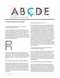
Cassidy: I’ve been into letters and letterforms, in general, for as long as I can remember. According to my mom, some of my first favorite things were letters like K, X, Q, and Z. She says that even before I could read, those letters would make me laugh. Folk typography is definitely a more recent interest. I do remember the very first folktype letterform that really wowed me: it was a capital R on a hand-lettered sign in a Mexican restaurant in San Francisco, and it looked something like this: [image]
It just blew me away. In twenty-some-odd years I’d never seen anything like it, and the person who did it probably didn’t even realize what they’d invented: they had changed the fundamental structure of the letter, not just its surface qualities. That must have been around 1992 or ‘93… it’s been in the back of my mind ever since!
(Ian speaking) What was the inspiration for Graffiti Archaeology?
Cassidy: Curiosity. It breaks into two parts, I guess. The first was just loving the way graffiti writers work their letters, especially wildstyle pieces, and wanting to learn more about them. The second part was riding the bus every day past a big empty parking lot with graffiti-covered walls, and noticing that the walls were changing almost every day. The memory of that place was the germ of the project. It didn’t come to fruition, though, until a full decade later.
(Ian speaking) Can you tell us about that?
Cassidy: I finally got off the bus and started shooting photos in 1999. Psycho City was long gone by then, but there were plenty of other interesting places to shoot. And at that time Graffiti Archaeology was still a subconscious thing— I wasn’t planning for it or anything like that. I was just poking around looking for tags and pieces I liked, and shooting them on film. I wish I hadn’t been so stingy with the film in those days, because there were a lot of treasures I passed up shooting because I only had so many rolls of film in my pocket. Anyway, it was a few years after that, in 2002, that I looked back at all my photos, and realized I had several layers’ worth of certain walls. At that point I started experimenting with ways of assembling the pictures into some kind of timelapse. That was also when I started scraping photos off the web, to find other pieces of the puzzle. I developed a pretty
decent workflow for doing the timelapse photocollages. And then my friend Eric Rodenbeck (of Stamen Design) helped develop the Flash interface you see on the site. So by the end of 2002, the site was live on the web.
(Joseph speaking) Cassidy— what kind of response have you received from the street art community?
Cassidy: It’s been great. Here in San Francisco, I meet writers from time to time, and about half of the ones I’ve met had already heard about the project. Everyone who’s heard of it or seen it seems to like the idea. A few of them have gone so far as to send me their own photos to include in the timeline. Those shoeboxes full of photos are like the finest treasure to me. In fact, a friend just dumped one on me the other day, and going through it has been a total blast!
(Ian speaking) What sparked your general interest in lettering?
Cassidy: I can’t remember ever not being interested in lettering. It’s one of those subjects where the more you learn about it, the more you realize you have left to learn. I was fascinated by foreign alphabets as a kid. Actually one of my earliest memories of really digging into foreign alphabets was a set of mix tapes my friend Toby made for me in sixth grade, which he covered with clippings from Chinese and Russian newspapers. Toby and I lost touch with each other years ago, but I was psyched to learn that he grew up to be a very accomplished designer (Tobias Frere-Jones) who designed one of my favorite fonts (Gotham). And then in high school I started reading Douglas Hofstadter’s books, which got really deep into the conceptual structure underneath letters, which was a huge influence. By college, my sketchbooks were starting to fill up with alien letterforms and nonsense calligraphy, and that’s still what comes out of the pen when I’m doodling.
(Ian) I feel like there’s something tremendous to be learned about human consciousness and intelligence by studying the way we give meaning to these abstract shapes. I think that’s what keeps me interested, the pursuit of that elusive but wonderful idea.
(Joseph speaking) Cassidy— Steve Powers quipped that the difference between art and graffiti is a matter of catering: “Graffiti gets you a baloney sandwich, and ‘work of art’ gets you wine and cheese.” With the acceptance of street art, some street artists are getting wine and cheese. There’s a couple of college courses on graffiti now. Designers are picking up stencils, stickers, and spraycans. Do you think street art has been absorbed into mainstream culture?
Cassidy: I’d say the aesthetic surface appearance of writing already has been absorbed into the mainstream, what with all the video game and T-shirt sales. The social, philosophical, cultural side of it hasn’t yet, but that’s because it is in a lot of ways antithetical to the status quo.
(Cassidy) Ian, did you start out as a graffiti writer and then later turn typographer, or vice versa?
Ian: I fooled around, but was never a real writer. I was far more involved in making zines and DIY publishing. It was from there that I transitioned into formal graphic design and typography. I had been designing materials that I was publishing for years, but without any type of formal training. Graphic design and typography was the logical next step and I lucked into having some great mentors in Portland and LA.
+(Cassidy) Handselecta (by Christian Acker) is at least partly about preserving and documenting local and regional handstyles before they get homogenized away by globalization. Do you think we’ll see origins of new typographic species in our lifetime?_
Ian: Unsure about “species” per se, but there are enough experimental alphabets out there that the envelope is definitely being pushed. A lot of graffiti writers are really pushing things formally, as are folks who try to push legibility/readability in typefaces. As far as linguistic reform is involved, on occasion (with proper backing and encouragement) new alphabets blossom in a formally advanced and rapid rate. Look at hangul, the Korean writing system or the Inuit writing system. Each exhibits really intriguing formal qualities. I really dig failed attempts at linguistic reform— there have been many attempts at reforming the written system of Japanese, and while none have stuck, they look interesting as hell. There’s a great article about one attempt by Matt Treyvaud here.
(Cassidy) Jens Gehlhaar was really onto something with his thesis.
Ian: Jen’s thesis project was really interesting. He called his thesis project “The CIA Compendium” (CIA meaning California Institute of the Arts). He sums it up best here: “The CIA Compendium project is inspired by one of the basic questions of type design: How do the skeletons of the Roman alphabet really look? What makes a G different from a C? Why are some lowercase [g]s double-storeyed and some single-storeyed? How much can you depart from the letter concepts learned in school and still remain legible?” He really attacked the Roman alphabet from all angles: art deco, modular, Roman, sans serif, and gothic typefaces are all included. Just the sheer volume of character style exploration is amazing.
_(Joseph) Ian, speaking of your book, Parallel Strokes, you
researched and worked on it for six years?_
Ian: The whole time was spent really learning and becoming conversant with and studying lettering as it applies to calligraphy, sign painting, commercial lettering, writing, piecing, and designing type. I stumbled into graphic design as a potential career after a prolonged adolescence that lasted well into my late 20s, and became quite smitten with the practice wholeheartedly. My focus in graphic design has trended toward the typographic, due to the influence of some really great teachers and an unhealthy influence in Letraset’s phototype catalog from the 70s from my zine days. I started working on the book for an independent study class that I never completed in undergrad, but under that pretense was able to talk to some really great type designers like Matthew Carter, some unique lettering folks like Stefan Sagmeister, and a whole lot of mediocre type designers. You learn a lot really fast talking to type designers.
Around the same time, I started working for a few small design studios who let me have a hand in designing custom typefaces for assorted corporations and I was able to get a basic working knowledge of type design as a craft that way. Simultaneously, I was introduced to a really great handful of accomplished and intelligent graffiti writers, including most particularly Smyl and Joker. They, along with the amazing Susan Farrell of Artcrimes, understood my hybrid interest and really encouraged a more academic look at writing. If not for their constant support, the book would never have happened. I just kept interviewing people when I had time, while developing professionally and academically.
I have been lucky to get crash courses in sign painting from John Downer; type design from the folks at Plazm/Plazmfonts (who passed on a lot of knowledge they gleaned from Matthew Carter, among others) and Jeff Keedy; and honing a critical perspective from the faculty at CalArts’ graphic design department. I started writing for a few different websites, most notably PingMag and Néojaponisme.
Lettering comes from the hand and this where graffiti writers get it right— they either figure things out innately through repetition or really contest how letters can be formed by forcing letters to work with them through repetition. There are a number of calligraphic geniuses out there begging to be discovered. I would love to force Jib, a writer in San Francisco, to work on a project with Jeremy Tankard, a British type designer, for a few weeks. They both are obsessed with ligatures, and I think they could both gain an infinite amount from sitting around and drawing/writing together.
(Cassidy) Ian, how long have you been living/working in Tokyo?
Ian: I’ve been living in working in Tokyo for over three years now. The initial transition was pretty difficult for me— my intrinsic stubborn inner American was really working against me linguistically for the first half a year, but I just battled through it. Kept studying the language and how to properly design Japanese typography. I do a fair amount of design in Japanese these days— books, magazines, websites, and identity work. I really enjoy it. Japanese typography is intrinsically different from Western typography. It looks better and reads better when set vertically. Learning a whole new range of typographic connotation has been really great, as well.
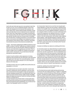
(Ian) Cassidy, I am curious about your letter-related synaesthesia. Do you ever get mixed signals? If a letter is pre-colored in the “wrong” way, will it cause you to misread it?
Cassidy: Ha, that’s a really interesting question, and I love your example graphic! I do get mixed signals sometimes. The best example of this is my refrigerator magnets. The magnets on my fridge are all the wrong colors. Every single one. And that actually makes it much harder than usual for me to find the letter I’m looking for. As for your C/G example [see PDF], I see what you’re getting at, and I can imagine a kind of Necker Cube effect where the shape flickers back and forth between two letters, or two colors. But I don’t actually experience that in this case because the shapes of the letters are still pretty readable. The one on the left definitely looks more like an A to me, and the one on the right more like an H.
(Ian) Cassidy, what new projects do you have up your sleeve?
Cassidy: I don’t know, I’ve never been able to look up my own sleeve. The projects just sort of pop out onto the table at the most inconvenient time. Graffiti Archaeology is where most of my spare time and energy goes these days, so most of my plans have to do with taking that project in different directions. I’m working on a variation right now where I’m collapsing one or two years of changes into a single massively high-res picture. Haven’t decided exactly what the right venue will be for displaying that image yet, but I have a feeling it will be a physical print of some sort.
The thing that really interests me these days is the consensus hallucination of meaning that we assign to these abstract graphic shapes we call letters, and the idea that that consensus could change over time. That’s why I dug Jens Gehlhaar’s project when I saw it in your book, it seemed to be getting at the idea that there’s something inherently arbitrary there. And arbitrary things are somehow less likely to be permanent. That’s what ties together all my other typographic interests: folk typography and graffiti especially. I see these as the two areas where the underlying letter-concept is most likely to undergo rapid structural change in our lifetime.
Ian: I am unsure if it really is arbitrary, so much as what Jens was doing was a really thorough study of the boundaries of legibility within a structured canon. Letters are things that have to define themselves to the viewer— while the shape may flex, it has to adhere the most scant grip of readability. However, I do agree with your statements about graffiti and vernacular lettering (note that I use the term lettering, and not typography).
(Joseph) Reminds me of Zuzana Licko’s comment about legibility:
Typefaces are not intrinsically legible. Rather, it is the reader’s familiarity with typefaces that accounts for their legibility. Studies have shown that readers read best what they read most. Legibility is also a dynamic process, as readers’ habits are everchanging. It seems curious that blackletter typestyles, which we find illegible today, were actually preferred over more humanistic designs during the eleventh and fifteenth centuries. Similarly, typestyles that we perceive as illegible today may well become tomorrow’s classic choices.
One last question: what are your book recommends?
Cassidy:
The Alphabet, by David Diringer
The World’s Writing Systems, Daniels and Bright
Writing Systems, Geoffrey Sampson
Metamagical Themas, Douglas Hofstadter
Fluid Concepts and Creative Analogies, Douglas Hofstadter
The Codex Seraphinianus
Writing: Urban Calligraphy and Beyond
Ian:
History of Graphic Design, Phillip B Meggs
Elements of Typographic Style, Robert Bringhurst
Looking Closer I-III, Texts on Type
Design Writing Research, Ellen Lupton & J. Abbott Miller
Stop Stealing Sheep, Erik Spiekermann and E.M. Ginger
Envisioning Information, Edward R. Tufte
Josef Müller-Brockmann, Lars Müller
Jan Tschichold: A Life in Typography, Ruari McLean
Unjustified Texts: Perspectives on Typography, Robin Kinross
Type and Typography, Phil Baines and Andrew Haslam
Thinking with Type, Ellen Lupton
Oubunshotai, Akira Kobayashi
Elements of Typographic Style by Robert Bringhurst is a must read if you do typography, period. Los Angeles Barrio Calligraphy by Jerry and Sally Romotsky is a great primer on the history and construction of West Coast barrio graffiti. Metro Letters by Debora Littlejohn sports a couple of great essays, but the one by Gail Swanlund rules. Her essay is probably my favorite piece of writing within the corpus of graphic design literature. Lift and Separate by Barbara Glauber has some great assessments of vernacular lettering, and John Downer’s essay within is potentially the first place in the canon of graphic design writing where graffiti lettering is truly given formal consideration.
(Joseph) These are fantastic resources. Thank you both. •