high design, low design
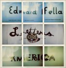
Ed Fella discusses using vernacular signage as inspiration in Letters on America :
‘I use low design to make high design, non-condescendingly. It’s a kind of bio-feedback; it’s visual reference material at its simplest.’
Fella’s collection of polaroids in Letters on America is a wunderkammer of folk typography, vernacular signage, and indigenous hand-lettering. The best part? It’s completely non-ironic— no kitsch, no camp, no wink-wink nudge-nudge. This is a sincere fascination with how letters and type mutate and evolve out in the vast territory otherwise known as everyday America.