LAB: never a shortage of taglines
Some of the alternate taglines almost picked for this issue of LAB:
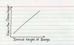
LAB: highbrow, lowbrow, no brow.
LAB: inconsistent by design.
LAB: for really really really ridiculously smart people.
LAB: Short. Concise. Liberal with periods.
LAB: semicolons are for wimps.
LAB: ALL CAPS, ALL THE TIME.
LAB: It’s not an acronym. Stop asking already.
LAB: for tech-savvy mavericks. GRRRR!
testing the water

Here we go!
As LAB dips its little pinky toe in the water with issue 0.5, we’re asking ourselves many questions: will the water be cold or lukewarm or hot? what kind of a body of water is this— a pool, a bathtub, a lake? and if it’s a pool, has it been peed in much? and how just how far can we run with this ‘testing the water’ metaphor, anyway?
So, voila: with jazz hands and a bright smile and with equal parts of pride (like you get when showing off your uncle’s glass eye at show’n’tell in 2nd grade) and embarrassment (like when you find out from the principle that it’s not appropriate to bring a family member’s ocular prosthesis to school), we offer up the LAB zine beta to you, Dear Reader.
Feeling a little confused? That’s okay. Jazz hands tend to have that effect. For more background on what the heck this is all about, check out the introduction to issue 0.5. If you’re not much into prefaces and intros, then just go ahead and plunge into the issue. Don’t worry— we guarantee it’s pee-free.
The Holy Grail of No Style

While re-reading Tibor Kalman: Perverse Optimist, I ran across this passage from David Byrne (entitled The Holy Grail of No Style) which resonated with me:
Tibor and company don’t have a signature style, and that is a worthy ambition in life. In baseball metaphor land, if the pitcher keeps changing styles, the batter doesn’t know what’s coming at him, so he has to be ever-alert. (And I don’t even like baseball.) Once you’ve been pegged with a signature look, style, layout or typeface, you may as well get someone else to do your work. An established signature style is read as something that’s already in quotations. That cool “Blue Note Records” look, that “50s-60s Conde Nast” look, that “pyschedelic record cover” look. Having a recognizable style relegates you to the status of quotable icon. And while being an icon is flattering, I imagine, once it happens, you become irrelevant.
While pasting up issue 0.5, design consistency was a topic that came up again and again. Should the entire issue have one easily recognizable style? This would be the easiest and most efficient way to do it— to plop all the content into uniform buckets. But, we felt, it would be much more interesting to derive each article’s design & layout from its content, or at least let there be some dialogue between content & design. Maybe let it grow somewhat organically, and then find the threads that tie the whole thing together. So this is the method that was used— inconsistent, quirky, inefficient, kinda messy. Oh— and time-consuming. Hence, the birth of one of our taglines: LAB: inconsistent by design.
But, above all, the design was molded to the content, instead of vice-versa. In retrospect, it would have been far easier to build some boxes and dump everything into ‘em. Meanwhile, we hope LAB‘s little context-specific idiosyncrasies will make things a little more interesting. Because there’s something to be said about noticing the little discrepancies and learning to enjoy them, as David Byrne testifies:
Having a non-style is more slippery, amusing, and surprising than sticking to one nice recognizable look. It’s a way of staying half-awake, or noticing things, enjoying things and learning to love things— especially the vernacular and banal things that have been relegated to the garbage heap of design.
indexed
Who knew charts & graphs could be so fun? On Indexed, some of the more complex issues in life are summed up on the humble 3×5” index card:
indexed.blogspot.com
Edward Tufte (author of The Visual Display of Quantitative Information) would love this stuff, I’m sure. His stuff is fantastic— worth a few dozen posts in itself. Looking forward to reading his essay, The Cognitive Style of Powerpoint: Pitching Out Corrupts Within. Tufte’s sense of humor reminds me a little of James Howard Kunstler (Geography of Nowhere, Eyesore of the Month)... I would love to see a discusion between these two.
And speaking of statistical graphics and whatnot, this is possibly the most delicious chart I’ve ever seen:
Napoleon’s March by Charles Joseph Minard
vernacular meets modern
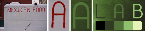
Just realized the rounded-off A on this Mexican food cart is the same rounded-off A in the current LAB logotype. Uncanny. I think it might be an ancestor. Vernacular meets modern. Oh, how I loves me a design convergence!
LAB: now with 200% MORE text!

Here at LAB, we like taking the hard way. So, we’ve gone thru and added text versions of all the articles (well, all the articles that aren’t already available on the web). How’s it work? Click the text link, and the text of the article will auto-magically appear. Pretty sweet, eh? Those who are having trouble with downloading PDFs (or have a slow connection) can now read the text online. Of course, the PDFs are all full of eye-candy and design-y goodness. But sometimes you gotta do what you gotta do.
SO: now LAB issue 0.5 is available:
- in print, via Lulu
- in PDF format, online
- in PDF, as individual articles, online
- in text format, online
Like I said, we like making things as complicated as they can possibly be. Next up: LAB, the ASCII version.
In other news, we’ve added a nifty little feature: you can now turn off the page-flippin’ action on the Issue Previewer. Why would you wanna do that? Let’s see:
- you hate Flash
- you’re stuck in dial-up land
- you’re in a cafe with a dozen other folks suckin’ up the internet juice
- you hate gratuitous eye-candy
- all of the above
In the works: a rating system for articles. Weee!
get your rate on!

Hooray! The first phase of our rating system is in place. How’s it work? Well, on each article, there’s five little stars under the Previewer thingie. And what you do is, you see, you make a wish on each star, and as you make each wish, you click on that star, and it comes true! Oh… wait… I’m getting an electronic message from our techie people… okay, it seems like I might have not phrased that quite right. Oh. OH! I see. You rate the article 1–5 stars, based on how much you liked (or disliked) the design, content, and over-all presentation. And this will help us pick stuff for the next issue. Well, ain’t that nifty? Go get your rate on!
welcome, metafilterites!
Come on in and have a look-see. We’ve just added a rating feature, so things might be a little buggy right now. But you can always grab a (free) PDF of issue 0.5 here and browse away at your leisure. Or: if you’re feeling flush, order the print version from Lulu.
If your time budget is tight, let me recommend the following:
- Get Your Interview On | interview with David Rees of Get Your War On
- Dear Sir: Ray Fenwick Is a Genius | interview with the mastermind behind Hall of Best Knowledge
- We Are the Media | interview with Derek Powazek, co-founder of JPG magazine
flist!
Just one of many yummy little morsels from Omnivore magazine:
Flist
As noun, the word means essentially a flash— a flash of lightning, a flash of wit, a burst of temper, the spark of an idea, an inspiration, a whim. (People there [Scotland] snap their fingers and say, “I just had a flist!”) It is also used in bottle-opening: “Time to flist that bottle!” It is variously spark, flare, light, astonishment, leap of the imagination. It carries these meanings well; and it remains always crisp in the memory.
—excerpt from Flist, Alastair Reid
The prototype issue of Omnivore came out in 2003, a collaborative project headed by Lawrence Weschler (author of Mr Wilson’s Cabinet of Wonder and Everything that Rises) and backed by NYU. The publication is currently in hiatus, and the first issue…
Tibor on vernacular design

An excerpt from Tibor Kalman and Kerrie Jacobs’ polemic on the role of design in culture, published in Print (Jan/Feb 1990):
Often the best design, the most important design, takes place outside the profession,where this is still a true vernacular. A non-corporate, non-designed vernacular. Vernacular is slang, a language invented rather than taught. Vernacular design is visual slang. More than that, it’s design that’s so familiar that we don’t really see it. Seeing the vernacular is seeing the invisible. It is looking at something…
folk typography on flickr

One of the more obscure groups on Flickr: folk typography. It’s dedicated to outsider or vernacular letterforms that weren’t created by designers or professionals. But not just any regular ol’ vernacular— these are letters that “show at least one example of a surprising design element that no professional ever would have thought of.” I gotta say, I love this group. It’s tightly-focused and well-run, and it’s one of the few groups I constantly come back to. And while some of the examples of typog brut take fugly to new heights (and some are good for a chuckle), I find myself coming away from a browsing session more impressed and inspired than anything else. Hats off to group founder Cassidy Curits for curating this fantastic wonder cabinet of curious letters.
Piet Schreuders on found typography
Excerpt from an Eye interview with Piet Schreuders:
MB: You are seen as a precursor of vernacular design.
[PS:] Well, it was kind of nice, ten years ago, to see that others, too, were interested in “sloppy typography” or “found typography”. But then it became a pigeonhole and I don’t like to be pigeonholed. What relevance does it have, when some art historian thinks up a name for it? For me it is more a matter of taste, of sensitivity: you see something and you think “yes!” Only after that first feeling of recognition do you start to look at it with the eyes of a professional, in order to find out what is so nice about it, what it is that makes it so catchy, so moving. Then you think about whether you can mimic that quality. Obviously, when you copy it, it becomes something different, a pastiche or a quotation. I have made a lot of pastiches and learnt a lot from doing them. And I have done things in which that element is present in the background. I have tried to keep some of the artlessness of ordinary things – that’s what interests me most.
mummies, brains, and cow pee
No, we’re not talking about some kind of zombie thriller or Wiccan ritual. We’re talking about color. More specifically, an excerpt from the chapter on color in Alan Fletcher’s The Art of Looking Sideways:
Describing a colour in terms of something else has a long history. Homer wrote of ‘wine-dark’ seas, Romans called a particular blue from overseas, ultramarine, and a dye produced by a whelk, purple (porphyra). Take a herd of cows, feed them mango leaves, make a purée of the earth on which they’ve urinated day after day for months. Dry, refine, and you’ve got Indian yellow. Mummy (now unavailable) was a brown produced from grinding up Egyptian corpses. Caput Mortuum was a purplish-brown made of decomposed brains. Puce is named after the supposed hue of a flea’s belly (Latin pulex), and the blue of jeans (blue de Genes) after a shade once associated with the city of Genoa. The dye magenta was invented in 1859 and named to commemorate the Battle of Magenta which occurred that year. Crimson is derived from the Sanskrit word for the bug which produced the dye— a krmi. Like many colour names, turquoise is a semi-precious stone and although there is a proposal to call it grue— a combo of green and blue— I doubt it will catch on.
Alan Fletcher passed away this September. But his collected work continues to serve as a kind of giant wunderkammern for those with curious minds.