feeds

tags

archives

Ye Olde Alphabet

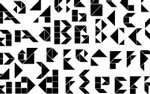
Alphabet: An Exhibition of Hand-Drawn Lettering and Experimental Typography, an exhibition at The Cooper Union, features what you might call a plethora of interpretations of Ye Olde Alphabet.

All these variations on 26 letters, yet we haven’t see many proposals for new letters in some time. Not that there hasn’t been attempts in the last few centuries: Benjamin Franklin, Jan Tschichold, and George Bernard Shaw are among those who proposed expanding the alphabet, according to this fascinating article: Six New Letters for a Renovated Alphabet.

Here, at the level of the alphabet itself, we have surely reached bedrock: it is the stable and unchanging essence of all letters, the referent for all pieces of type… In fact, alphabetical solidity is nothing more than a temporal effect: if we could use time-lapse photography to revisit the development of the 26-letter Latin alphabet used to transcribe English, we’d see that letters have been discarded, added, and reshaped almost beyond recognition. The alphabet itself is malleable, temporary, subject to reform and revision.

George Bernard Shaw left money in his will for the development of a new alphabet; the competition attracted 467 entries. The winner, Kingsley Read’s phonetically accurate alphabet of 48 letters, can be found as a digital typeface: Shavian. More on Shavian on Wikipedia here.

What will the alphabet look like in a 100 years? Digital type gives us new creative freedom, but we no longer have much need to reproduce letters by hand. Will the 26 letters of the alphabet become set in cement, metaphorically speaking, or will the new trend in handlettering bring back the evolutionary (and ephemeral) nature of type?

| 3 comments | tags: design typography


comments (3)

  1. When I studied design at Brigham Young University, we spent some time in early typography classes studying the Deseret alphabet http://en.wikipedia.org/wiki/Deseret_alphabet. Naturally, there was special interest at BYU since it was commissioned in the 1800’s by Brigham Young himself. It was a phonetic alphabet that was supposed to help the many new immigrants coming into Utah quickly learn to read and understand english.

    It was an interesting effort—they printed some books and sections of the newspaper using it—but it didn’t last very long. Among it’s problems were poorly designed/inconsistent letter forms and a lack of a true lowercase which made it difficult to read. One of our assignments was to redesign it (I would post a sample of mine but I’m not sure where it ended up).

    A new alphabet could certainly be useful (for starters, there’s the whole K/S vs. C issue), but it’s tough changing a system so fundamentally ingrained. But hey, just think of all the work to be had updating signage.

    Jeremy 10/07/07 at 8:08 p.m.

  2. Jeremy— thanks for the link + background. I’d heard about Deseret a while back. Fascinating stuff. Re: implementing a new alphabet, I agree— it’s not going to happen, even if a gaggle of typography geniuses invented the perfect alphabet. A good example of this kind of thing: QWERTY vs the Dvorak keyboard layout. By the way, if you come across your redesign of Deseret, send me a sample. I’m curious to see it.

    Joseph 10/09/07 at 8:53 a.m.

  3. I would consider the fact that the writing is much less important today than reading. So the new alphabet should be easy to read. Hence the characters and the words should be easy for the eye and the brain to recognize. It would require a serious research including the measuring of the overall gain in reading effectiveness. It is quite possible that the gain would be negligible compared to the expenses of introducing the new alphabet.

    Careless Feather 12/26/07 at 8:05 a.m.

post a comment


never shown on the site, nor shared.


e.g.: http://lab-zine.org/

You need to enable javascript in order to submit a comment. Thank spambots for this inconvenience.