hands-on lettering
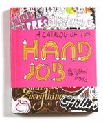
In Hand Job (Princeton architectural Press), Michael Perry selects some delicious hand-lettering from an array of designers & typographers. From the Amazon review:
In this digital age of computer-generated graphics and typography, it’s refreshing to find typographers who still believe in working by hand. No longer relegated to designer’s sketchbooks, hand-drawn type has emerged from the underground as a dynamic vehicle for visual communication—from magazine, book, and album covers to movie credits and football advertisements. As the practice and appreciation of hand-drawn type grows, it’s time to celebrate the work of those typographers whose every letterform is a work of art.
[ tip of the hat to Scrappers for the book recommend ]
bouba vs kiki
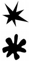
In Born on a Blue Day: Inside the Extraordinary Mind of an Autistic Savant, Daniel Tammet writes about an experiment which investigated a possible link between visual patterns and the sound structures of words:
The researcher, Wolfgang Kohler, a German-American psychologist, used two arbitrary visual shapes, one smooth and rounded and the other sharp and angular, and invented two words for them: takete and maluma. Subjects were asked to say which of the shapes was the takete and which the maluma. The overwhelming majority assigned maluma to the rounded shape and takete to the angular one. Recently, Professor Ramachandran’s team has replicated the results using the invented words bouba and kiki. Nintey-five percent of those asked thought the round shape was a bouba and the pointed shape a kiki. Ramachandran suggests the reason is that the sharp changes in the visual direction of the lines in the kiki figure mimics the sharp phonemic inflections of the word’s sound, as well as the sharp inflection of the tongue on the palate.
Maybe that’s how Ikea comes up with the names for their furniture designs. Then again, maybe not.