Pop Chart Lab's Various Varieties of Compendiums

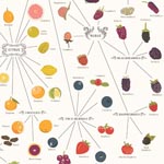
LAB <3's Pop Chart Lab's Various Varieties of Fruit chart. There’s also a companion: Various Varieties of Vegetables. And don’t miss this design duo’s Visual Compendium of Sneakers.
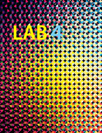
LAB 4 backstory

It’s been 5 years since the last issue of LAB was published. What has LAB been up to? Developing a secret viral meme in an underground HQ? The short story: I sustained a TBI (Traumatic Brain Injury) that left me nonverbal and severely cognitively impaired shortly after publishing the third issue of LAB. After recovering, I spent the next few years volunteering with an art studio for adults with disabilities (Port City’s Project Grow) and working as a care provider for people with disabilities. This year, with the encouragement of friends, I’ve taken a step back in the direction of editorial design.
A month ago, I launched a certain piece of design software for the first time in years. I placed a half dozen images, saved the document, and sat with tears running down my face. My hands still remembered keyboard command chords, and I could feel these areas of my brain that had gone dark start to light up again like Eric Fischer’s data visuals (page 46). Andy Gilmore’s vibrant geometric designs sparked my optic nerves. I listened to Matt Shlian’s advice to his Past Self from his Future Self: Do what you love and fuck the rest. Daniel Wojtkiewicz’s hyperrealistic oil paintings triggered a meditation on the beauty found in a wide spectrum of diversity, while David Eichenberg’s oil portraits allowed me to see beauty in individuals who were living out these lines from ee cummings:
To be nobody but yourself in a world which is doing its best, night and day, to make you everybody else— means to fight the hardest battle which any human being can fight; and never stop fighting.
Finishing the interview that I had started with Cassidy Curtis and Ian Lynam— over 5 years ago— helped me understand the gratification of number 33 on the 33 Things You Can Do To Stay Creative list: Finish something. And the next three points —
15: Collaborate.
16: Don’t give up.
23: Take risks.
— all encouraged me to continue working. Peter Jellitsch’s drawings allowed me to see beauty in curves, contours, and complex power dynamics. I continued to navigate around fear and insecurities left over from the brain injury, filled with a new kind of motivation— transforming pain into learning, growth, and beauty.
Francesca Pastine’s reconstruction of the cover of LAB (page 15) reminded me that deconstruction, reconstruction, and recontextualization is part of the creative cycle. Matt Shlian’s papercraft scultpures brought me a sense of serenity, equanimity, and gratitude. Meshu’s jewelry derived from travel data points opened new horizons. And Nelson Minar’s map, All The Rivers, reminded me of Harold Fisk’s 1940 map of the various courses the Mississippi River has taken over time. For me, this map is both work of art and visual metaphor.
Several themes for the issue began to emerge: beauty in diversity, global inclusion. Interdisciplinary cross-fertilizing, the evolving architecture of serendipity. Complex visual narratives, media makers leveraging social network dyamics to amplify powerful signals. All this led to LAB’s new statement of intentions: to amplify the work of amazing artists around the world.
Joseph Robertson
Editor, LAB magazine
city map anagrams

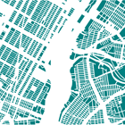
Enjoying these gorgeous city map anagrams from Armelle Caron.
Deconstruction, reconstruction, and recontextualization of urban city plans, creating a kind of visual anagram:
Caron deconstructs cities, identifies fragments, classifies blocks by size and shape.
Related: Things Organized Neatly.
Fisk's 1944 map of Mississippi River

Nelson Minar has cobbled together a viewer of Harold Fisk’s map of the various courses the Mississippi River layered over Google’s satellite imagery, with a slider to blend the two.
You can find a DIY data set for Nelson Minar’s All The Rivers map on Github.
More detailed renderings of All The Rivers here on Flickr.
AirBnB's top 50 markets

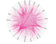
Rachel Binx’s data visual of AirBnB’s top 50 markets.
Thickness of lines corresponds to the relative volume of travels between each pair.
You can find more of Rachel’s work here: rachelbinx.com.
