Interactions of Color as an app
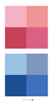
Josef Albers’s The Interaction of Color is now available as an app.
Yale University Press has released the work on the 50th anniversary of publication. Users can move and manipulate over 125 color plates in 60 interactive studies.
Josef Albers was a printmaker, photographer, typographer, and poet. He’s best known for his abstract paintings and color theory.
Van Gogh analysed by color
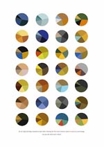
Arthur Buxton breaks down van Gogh paintings for a view of color schemes.
Buxton has visual analysis charts for Klee and Kandinksy as well. And a fascinating overview in Ten Years, Ten Artists.
In the same area: 20 years of Paris Vogue covers, a collaborative study of color trend visualization.
glitch textiles

Phillip Stearns’s work blurs the lines between photography, data visualization, textile design, and computer science. He creates portraits of raw binary data sourced from his computer’s physical memory. The process begins with extraction of data, 0s and 1s, then, using Processing, the raw data is rendered as an image. The images are then imported into NetGraphics, software environment used by textile designers to create weaving patterns.
block by block
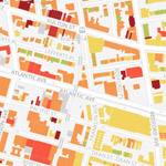
BKLYNR is a map that reveals the age of 320,000 buildings in Brooklyn.
The map reveals patterns of urban development and trends in development.
From the project description:
The borough’s a patchwork of the old and new, but traces of its history aren’t spread evenly. There are 320,000-odd buildings in Brooklyn, and I’ve plotted and shaded each of them according to its year of construction. The result is a snapshot of Brooklyn’s evolution, revealing how development has rippled across certain neighborhoods while leaving some pockets unchanged for decades, even centuries.
Listen to Wikipedia

Listen to Wikipedia. Recent edits as visual + audio.
From the project’s About page:
Listen to Wikipedia’s recent changes feed. The sounds indicate addition to (bells) or subtraction from (strings) a Wikipedia article, and the pitch changes according to the size of the edit. Green circles show edits from unregistered contributors, and purple circles mark edits performed by automated bots.
Alphafont #3, Matt W Moore
Series of Vectorfunk Posters celebrating each letter of the alphabet, by graphic artist Matt Moore.
More work from Matt Moore: Shooting Hoops, a series of street art.
From Matt’s website:
Matt W. Moore works to the credo of ‘range is conducive to growth.’ Like many artists of his generation, Matt’s background was in action board sports and the action art of graffiti, each with their core value of speed, do-it-yourself ethic, enthusiasm for new terrain, and sheer fun of collaboration.
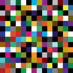
one second on the internet

Every second on the internet. A visualization of one second of activity on the internet.
Every second on the Internet, about 4,000 tweets are posted to Twitter. And about 33,333 Google searches are made. And about 46,000 YouTube clips are viewed.
But what does that actually look like? Like this.