
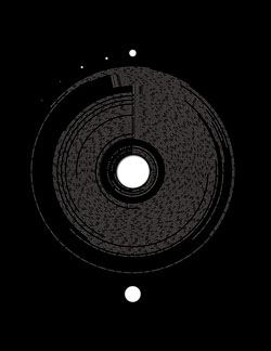
Everyone Ever in the World is a visual representation of the number of people to have lived versus been killed in wars, massacres and genocide during the recorded history of humankind. The visualisation uses existing paper area and paper loss (die cut circle) to represent the concepts of life and death respectively. The total number of people to have lived was estimated through exponential regression calculations based on historical census data and known biological birth rates. This results in approximately 77.6 billion human beings to have ever lived during the recorded history of humankind and is represented in the poster as total paper area (650mm X 920mm). The total people killed in conflicts was collated from a number of historical source books and was summed for all conflicts – approximately 969 million people killed, or ~1.25% of all the people to have ever lived (die cut area = 650mm X 920mm X 0.0125). The timescale encompasses 3200 BCE to 2009 CE – a period of over 5 millennia, and 1100+ conflicts of recorded human history. The sequence of dots to the top left of the graph shows the dramatic increase in the number of conflicts over the past 5 millennia (left to right : 3000 BCE to 2000 CE) with the most recent 1000 years being the most violent. The large dot below the graph represents the 1000 years to come : a predicted startling increase in the frequency of human conflict. The graph exemplifies the value imparted to data with regard to the manner in which it is visualized: the culturally attuned perceptual differences in absolute versus proportionate values. The absolute value of 969 million people killed in wars, massacres and genocide is an astonishingly high number. But when presented as a proportion of the total number of people to have ever lived, it becomes quite low, 1.25%. Most statistical measures are expressed as a relative value (eg. standardized as a percentage) which is represented in the graph with the die cut circle. Death counts in humans is one of the few instances where absolute values are culturally accepted as appropriate – likely due to the absolute value placed on human life.
The relative simplicity and intuitive graphical approach of using a die cut area to represent total people killed, lends a direct poetry to the concept and affords the viewer an instantaneous assessment of the degree to which conflict has shaped human history. Printing in transparent ink allows for a visual assessment of die cut area as compared to paper area without interfering graphics. The graphic simplicity of the poster belies the necessary complexity of mathematical modeling of cumulative population size and the depth of research required to obtain death counts for all conflicts of recorded human history. However, it is the very same simplicity of representation that imparts a sombre and respectful tone to such a weighty subject matter. Everyone Ever in the World is as much focussed on the content of the data presented as it is an exercise in the use of unique materials and print processes to express a concept. All three editions of the project use different materials and printing to approach the concept of life contrasted with death in a manner which brings meaning and understanding to the data.
Project description: Peter Crnokrak