
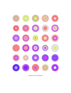
Winds.process.2013.01, Mark Nystrom
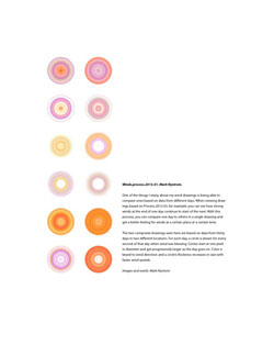
One of the things I enjoy about my wind drawings is being able to compare ones based on data from different days. When viewing drawings based on Process.2012.03, for example, you can see how strong winds at the end of one day continue to start of the next. With this process, you can compare one day to others in a single drawing and get a better feeling for winds at a certain place at a certain time.
The two composite drawings seen here are based on data from thirty days in two different locations. For each day, a circle is drawn for every second of that day when wind was blowing. Circles start at one pixel in diameter and get progressively larger as the day goes on. Color is keyed to wind direction and a circle’s thickness increases in size with faster wind speeds.