the book on a bookshelf is a curious thing

From Henry Petroski’s The Book on the Bookshelf:
Like wrestlers in a ring, two books on an otherwise empty shelf lean against each other in an uneasy stance. Three books are like one basketball player caught between two opponents in a double-team. More books are like a pack of schoolboys, playing Johnny-Ride-a-Pony against the school yard wall. Mostly, however, a shelf-not-full of books is a train full of commuters caught frozen in time leaning against one another in a tenuous balance between gravity and acceleration.
Less is less and more is more.
Another quote dump from Alan Fletcher’s The Art of Looking Sideways:
Mies van der Rohe:
Less is more.
Robert Venturi:
Less is a bore.
Frank Lloyd Wright:
Less is only more when more is no good.
Norman Foster:
Achieve more with less.
Gianfranco Ferre:
More is more.
Theo Crosby:
Less is less.
Ivana Trump:
As you get older less is always more.
Rodney Kinsman:
Less is more— providing you had more to begin with.
lead, vinegar, and horse manure
As far back as Roman times, white has been considered one of the most dangerous paints, due to its high lead content. The formula for creating white paint involved placing thin shavings of lead over bowls of vinegar, then collecting the white deposits of lead carbonate. Which was nothing compared to the Dutch technique for preparing white paint around Rembrandt’s time, described in Victoria Finlay’s Color:
The Dutch or “stack” process involved using clay pots divided into two sections— one for the lead and the other for the vinegar. The apprentices would line up several dozen of these, and then they would add the secret ingredient— great bucketsful of manure straight from the farm, which would be heaped all around the pots to produce not only the heat to evaporate the acid but also the carbon dioxide to transform the substance from lead acetate to basic lead carbonate. The room would be sealed, and was left closed for ninety days, after which the apprentices would no doubt draw straws to see who got the unpopular job of going in to get it…. in those months, the stagnant heat, gurgling excrement, sour wine and poisonous metal would have worked their alchemical magic, the dirt and the smells metamorphosing into the purest and cleanest white, which formed in flakes or scales on the gray metal. It was one of the many small miracles of the paintbox, the transformation of shit into sugar.
White lead was replaced by the much safer titanium dioxide in the 1920s, but many artists still insist that nothing can compare with the opaque quality of lead white. More on the origin & history (including Vermeer’s usage) of lead white can be found here.
welcome, craftsters!

“Oh my! We have company.”
If you just found us via that aggregation of crafty goodness known as the CRAFTzine blog, please, come on in and take a look-see. We’ve got plenty of interviews with creative craftsters in our first issue:
Queen of Craft | interview with Leah Kramer
We talk with Leah Kramer (founder of Craftster.org) about the future of DIY crafting, what happens when you make tea cozies without irony, and what a typical day is like at the Craftster Castle.
#@%&! Potty Mouth | interview with Julie Jackson
The naughty potty-mouthed genius behind Subversive Cross Stitch talks about the idiot boss that drove her to stitch four-letter words in her spare time. And, yes, she does kiss her mother with that mouth. In fact, her mother helps her brainstorm new patterns!
Talkin’ to the Boss Lady | interview with Deb Dormody
Master bookmaker Deb Dormody (of If’n Books) discusses the craft renaissance, the influences of Pee-Wee’s Playhouse, and the centuries-old rivalry between bookbinders and jewelry makers.
What else? Pirate fashion and sea monkeys…
Fuck up fast. And fail harder.
Great quote from Caterina Fake (co-founder of Flickr) from this Inc interview:
We did all kinds of dumb, stupid things. But our unofficial slogan was, ‘Fuck up fast.’ Make mistakes rapidly, learn from them, and move past them.
Excellent advice. And one echoed by this WK+12 project: Fail Harder (link to QT movie).
How can this post use the color purple?
A short excerpt from Beautiful Evidence in which information design master Edward Tufte makes a solid case for function leading form:
The Sixth Principle for the analysis and display of data: Analytical presentations ultimately stand or fall depending on the quality, relevance, and integrity of their content. This suggests that the most effective way to improve a presentation is to get better content. It also suggests that design devices and gimmicks cannot salvage failed content.
The content principle points to priorities in analytical design work: this is a content-driven craft, to be evaluated by its success in assisting thinking about the substance. Thus the first questions in constructing analytical displays are not “How can this presentation use the color purple?” Not “How large must the logotype be?” Not “How can this presentation use the Interactive Virtual Cyberspace Protocol Display Technology?” Not decoration, not production technology. The first question is What are the content-reasoning tasks that this display is supposed to help with? Answering this question will suggest choices for content elements, design architectures, and presentation technologies.
"Beg forgiveness, lazy reader!"
Imagine only being able to check out one book a year from the library… and when returning that book, if you hadn’t finished reading it, having to ‘fall on your face’ and beg the librarian to forgive you? “Beg forgiveness, lazy reader!” Sounds like a Monty Python skit, no? But that was life in the eleventh-century, if you were in an English monastery:
On the Monday after the first Sunday in Lent, before brethren come into the Chapter House, the librarian shall have had a carpet laid down, and all the books got together upon it, except those which a year previously had been assigned reading. These brethren are to bring with them, when they come into the Chapter House, each his book in his hand… then the librarian shall read a statement as to the manner in which brethren have had books in the past year. As each brother hears his name pronounced he is to give back the book which as been entrusted to him for reading; and he whose conscience accuses him of not having read the book through which he had received, is to fall on his face, confess his fault, and entreat forgiveness. The librarian shall then make a fresh distribution of books, namely, a different volume to each brother for his reading.
Quote excerpted from Henry Petroski’s The Book on the Bookshelf (previous post here), a book which, if skimmed briefly in a bookstore, might seem possibly one of the dullest books ever written (a book about how books are placed on bookshelves?). Polysyllabic academic writing style aside, this sort-of-meta book makes for a fascinating read, as it traces the history of how books are stored from the times of painstakingly scribed single-edition manuscripts locked up in monks’ armoires all the way up to modern libraries with moving bookshelves. Interesting stuff for anyone interested in information science.
trim
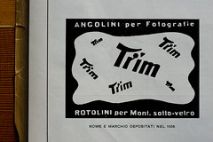
Found this ad in the back of an Italian arts magazine from 1957, L’illustrazione Italiana. I think it’s an advert for a photostat service. Though I could very well be mistaken, seeing how I don’t know Italian.
But check out that "r" in "trim." It appears to be growing a head. Yowza.
Take a gander at the biggified version.
what happened to the interrobang‽
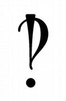
The what?! According to wikipedia, the interrobang is “a rarely used, nonstandard English-language punctuation mark intended to combine the functions of a question mark and an exclamation point.” Example:
You pierced your what?! = You pierced your what‽
Concocted by advertising mogul Martin Speckter in 1962 to pack a punch in ads, it never quite caught on. Some of the proposed names for the bright-eyed punctuation mark included exclarotive and exclamaquest, but interrobang won out. It’s definitely catchy, but it sounds a little like some type of horrendous act that the UN would include on its list of war crimes.
Find out more about the interrobang here on wikipedia.
that guy who published Emigre
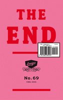
In the last issue of Emigre (no 69), co-founder Rudy Vanderlans looks back over 20+ years of publishing a magazine that made the design community dance like it had ants in its pants. Instead of a tedious rant or misty-eyed nostalgic piece, we get 69 short stories about some of the goings-on at the Emigre office during each issue. This little pink booklet is a great read for anyone looking into some DIY publishing. It’s not going to tell you how to publish a magazine (Rudy himself says that he essentially just learned as he went along), but it gives you an idea of what goes on behind the scenes. Which is both inspiring— and a little frightening. From the introduction:
It may be premature to wonder what Emigre’s legacy will be and how (or if) it has influenced others. Time will tell. But there’s little doubt it has influenced me. Over time, the magazine came to define me. I was often introduced as “the guy who publishes Emigre.” This always sounded strange to me, as if I knew what I was doing. Editing, designing, and publishing Emigre magazine was largely a learning experience. I still feel I’ve only scratched the surface. Entrepreneurialism should not be mistaken for having some cool ideas and going out on a limb. Ideas are cheap. It takes perseverance and business acumen to turn them into something worthwhile.
And from the brief chapter about issue 21, Rudy says,
I pinned a Bukowski quote on the wall behind my computer. It reads: ‘Some people like what you do, some people hate what you do, but most simply don’t give a damn.’ This sentiment consoles me.
You’ll find a wikipedia stub on Rudy Vanderlans here, and the official Emigre site here.
thou shalt lay headlines large and at the top of the page
There’s some juicy tidbits in Paul Felton’s The Ten Commandments of Typography/Type Heresy. Here’s one of ‘em— a quote from Barry Dreck:
I am really interested in typography that isn’t perfect, type that reflects more truly the imperfect language of an imperfect world, inhabited by imperfect beings.”
This little cloth-bound hardcover book (with its gold hot foil stamped cover) makes for a delightful reading experience. For half the book, The Ten Commandments of Typography, you get, well, the classic (and very sensible) rules of setting clean, legible text. The other half (which you flip the book upside down to read), Type Heresy, gives you good reasons to break all ten rules. A very hyperbolic + binary method of showing both sides of the coin, but, with a healthy dose of irreverent humor, it works well. That old cliched truism bears repeating: you have to know the rules before you break ‘em.
et voilà!

Rodolphe Simeon, the photographer we talked to in this interview, has just launched his site:
m-peoplephotography.com
Rod does both studio & street work, and some of his portraits of homeless folks are incredible. Here’s Rod talking about one of his most memorable candid street portraits:
I once photographed a man whose face was seriously deformed. When I asked him if I could take his picture, he agreed immediately. As I went from looking at him directly, to looking at him through my camera, I was overwhelmed by his absolute self-confidence. He was completely himself, completely honest and sincere. At this moment, I felt that he changed something inside me profoundly. In a way, he showed me how you can exist by just being yourself.
Immaculate Heart College Art Department Rules
ANP Quarterly #6 just came out a week or so ago. This issue has some great stuff, including a piece on Sister Mary Corita Kent, the Catholic nun and experimental printmaker who led the art department at Immaculate Heart College. Here’s a sampling of the Art Department Rules during Corita’s reign:
Rule 4
Consider everything an experiment.
Rule 6
Nothing is a mistake. There’s no win and no fail. There’s only make.
Rule 8
Don’t try to create and analyse at the same time. They’re different processes.
Rule 9
Be happy whenever you can manage it. Enjoy yourself. It’s lighter than you think.