Sha Hwang and Rachel Binx of Meshu
“Data is people, folks!”
•
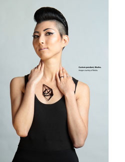
Meshu turns the places you’ve visited into pendants. Data visuals as fashion, infographics as sculptural elements. What’s the backstory on this concept?
SH: The short version — Rachel and I sat down together in a tea shop and started sketching out ideas we could work on together. The name, the idea, and even the look of Meshu were all sketched out in a short session. But the longer version of that story is that we have both been intensely fascinated with visualizations of our own histories, Rachel with her self-tracking, myself with maps of my own spending and visualizations of Foursquare checkins. We also were intensely fascinated with the rise of 3d-printing and lasercutting, and watched companies like Nervous System from afar with awe (Jessica and Jesse have since been very supportive, and we overlap a ton on Pinterest). With Meshu, we wanted to see if people would be interested in jewelry that was not just generative (as in Nervous System’s work), but personal and meaningful. The response for this has been wild, and really humbling. Most of our orders are really special gifts: places from a first date, places a sibling or spouse has lived, stops on a retirement cruise. The emotional weight of the orders we get has been the most staggering thing for us, and what makes Meshu so wonderful to work on.
That must be amazing — being able to take data with huge amounts of emotional significance and shape into a visual — and tangible — form. Speaking of visuals, with data visuals like Twitter’s map of the US, All of The Rivers, and Peer 1’s map of the internet app, we are seeing a new level of landscape merging with data. There’s an old expression: “the map is not the terrain.” But the terrain is being navigated in a new way because of the map. Where do you see data visuals taking us?
SH: I’m very excited about this more mainstream interest in data visualization. On some level, I see the medium growing much in the same way that photography did. You have the purists, like in Group f/64, you have the explorers like Marey and Muybridge, and you have the expressive humanists, maybe like Robert Frank. But these groups are all interested in seeing the world, and I think data visualization has this in it too. If we’re in the equivalent of the first hundred years of photography, perhaps soon we’ll see the DSLR equivalent, and then the smartphone equivalent. I think soon there will be so much going on that visualization, or some form of it, will be a way many people engage with the world they are connected to. A map, yes, but a terrain all its own too.
In that data visualization / photography analogy, what do you see potentially happening in the smartphone era? (In the next 60 seconds: 27,800 photos will be uploaded to Instagram, and 208,300 photos will be uploaded to Facebook.) We’re starting to see some data visuals emerging from photography, like visual signatures of cities based on Instagram photos (Hochman, Manovich, Chow).
SH: The exciting part for me in the smartphone era is the granularity and immediacy of the data. That you can literally map bus movements, figure out pedestrian hotspots, or look at traffic patterns in realtime is incredible from a city planning perspective, like all the work Singapore is doing with the MIT Media Lab, but there’s also the immediacy of eyes on-the-ground all over the world. The flip side of that is access, and audience — who are we looking at when we look at these maps of Instagram activity? Whose stories are not being told because they aren’t plugged in to the same networks?
Right. It sparks curiosity. What are the stories behind these photos? Are these stories being heard on a global stage? How are these people connected? How do they influence each other?
SH: Right, totally. And I think one way visualization can start to address this is by being a starting point rather than a destination. In an old Stamen project, Crimespotting, you could link to individual crime reports. People would print out screenshots and take them to the police departments and ask them questions about trends or policing practices, totally reversing the flow and giving these regular people a ton of agency. And similarly, in a project I worked on at Stamen for CNN, we were mapping coalition casualties in Iraq and Afghanistan. But rather than keep it a pretty picture, we asked CNN if they could build out pages for each individual soldier. It changed the project a lot, so the visualization becomes more of a living memorial, where you can read more about each soldier, see articles about them, and understand much more about what is usually a kind of terrifying and abstract thing.
Rachel, in an interview on iCharts, you said:
The rising visibility of data and visualization in the news is a powerful tool for communicating more about the story… for educating and inspiring people. I think that visualizations are an extension of the ‘picture is worth 1,000 words’ idea… Interacting with data helps people make deeper connections with that information.
Speaking of deeper connections with information, do you see data visualizations being incorporated into user interface more? Or even shaping user interface in real time?
RB: Most definitely! I think we’ve been seeing this trend already with all of the personal-data-monitoring devices that have been hitting the market lately (think fitbit, jawbone, fuelband). Once you assume that they all have about the same level of functionality, at least as far as counting steps each day, purchasing decisions come down to the analytics available on each. I’ve known people who have switched devices because they want to be able to analyze their data at a deeper level. I think this trend will manifest in many more fields; as people become more comfortable navigating visualizations, the demand for them will increase.
Sha— your personal website tagline is “postarchitectural.”
SH: I started out at Berkeley as a mechanical engineer, but almost immediately failed out. I ended up in architecture, which fired and shaped my love of design and cities. I left architecture not long after college, but I still think of myself as heavily influenced by my architectural background. Postarchitectural, then, not as after architecture, but as of architecture.
How does your love of cities and architecture influence your design?
SH: I’ve always been fascinated by cities. This has directed a lot of my visualization work towards looking at flows and patterns of cities. The company Eric, Vaughn, and I started, Movity, was explicitly about this examining of cities to help people find places to live. Like with the Instagram cities pieces, I think it’s really exciting to start to understand in a really detailed way the various patterns of cities. It’s a first step, at least, towards some hopefully more fine-grained ways of improving and redesigning cities.
Do you see cities embracing the connections between Big Data, social media, and urban planning?
SH: Honestly, I don’t really know. There are some cities opening up and trying to look at massively granular data with an eye towards urban planning, but I’m not aware of many looking at social media. Like I mentioned, Singapore worked a little bit with the Senseable Cities Lab at MIT to visualize taxis, shipping, and people, and some cities like Dublin are looking at transit data to better plan bus routes. Something that’s kind of wild to me though are the explorations that are literally out of this world, like the work Vizzuality did with NASA to help crowdsource exoplanet discovery. That you can send a ton of people to look at a problem from a different angle and come up with fresh information is exciting to me, and is a bit against the grain of the top-down ideas of what some people call the “Smart City.”
You also worked with Adobe Kuler Pulse.
SH: Kuler Pulse was my very first project at Stamen, so remains pretty special for me. It was an investigation into the use patterns and popularity of colors on Kuler, and let people explore that data by country and by tag. Japan had many more neons, for example, than the USA.
Fascinating. Reminds me of xkcd’s color survey— have you seen it?
RB: I love the color survey! It’s a wonderful example of language shaping thought, that knowing more color names pushes one to see the world in a finer grain. Cheers to Randal Monroe for collecting, parsing, and displaying all that data.
Books you’re currently reading.
SH: I’m still reading Seeing Like a State, by James C. Scott. It’s a fascinating study of the various ways governments have tried to instill control, or make resources more measurable, and how these methods often fail. For me it resonates both as a study of failed top-down urban planning and as a parallel towards today’s glorification of Big Data — that we can be easily modeled, measured, and predicted upon and against.
RB: I’m in the middle of Team of Rivals, chronicling Lincoln’s life through the lens of his political rivals. I’m learning a lot about US history! This is also a pretty large departure from my regular rotation of dystopian scifi novels. I recently finished reading Richard Morgan’s Takeshi Kovacs trilogy, comprised of Altered Carbon, Broken Angels, and Woken Furies.
Complex social interdependencies can be difficult (or nearly impossible) to predict, and many centrally-planned top-down schematic methods don’t factor this in. Do you see a possibility for Big Data to become more friendly, via social media analytics and storytelling? A sort of Stewart-Brand-esque How Buildings Learn kind of flexibility with some fine-grained context and social dynamics of Jane Jacob’s Death and Life of Great American Cities, but as applied to Big Data and data viz? Or, in simpler words, what solutions do you see emerging?
SH: As our models become more complex, we’ll hopefully move away from meat axe urbanism towards things more sensitive to the sidewalk ballet of Jane Jacobs. I think Big Data doesn’t have to become more friendly necessarily, but it does have to become more human. Whether this is through storytelling or social media, I’m not sure, but the first step there is to recognize and take care in the application of these schemes. Data is people, folks!
Final question: what inspires you each morning?
RB: Honestly, what inspires me each morning is that I get to work with such an amazing, talented, and inspiring partner. Every day we get to think about and work on different problems, and I couldn’t ask for a better person to do it with.
SH: What Rachel said. Plus travel.
Teamwork. Beautiful. Thank you two. •